Rajendra Tubinox
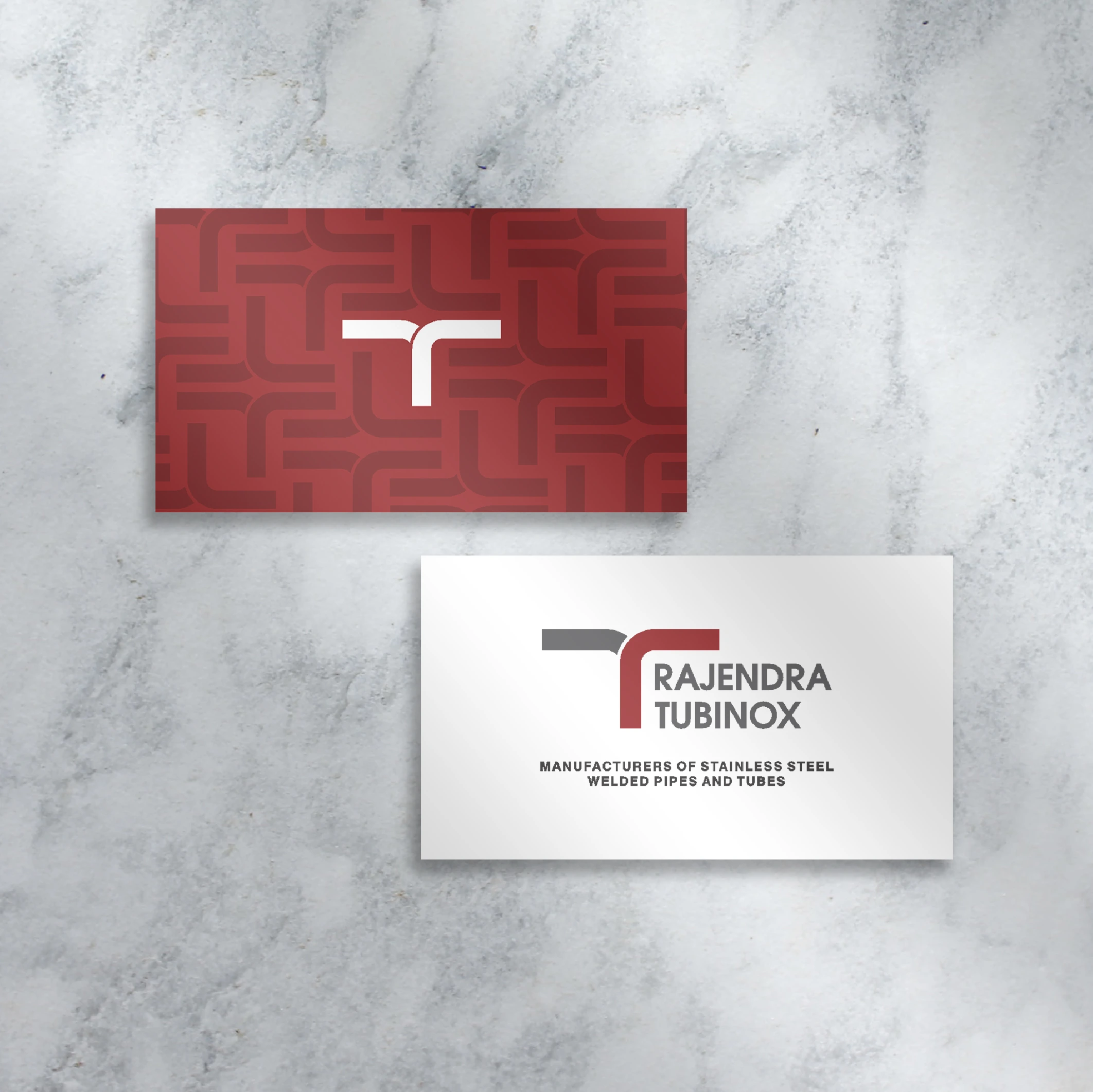
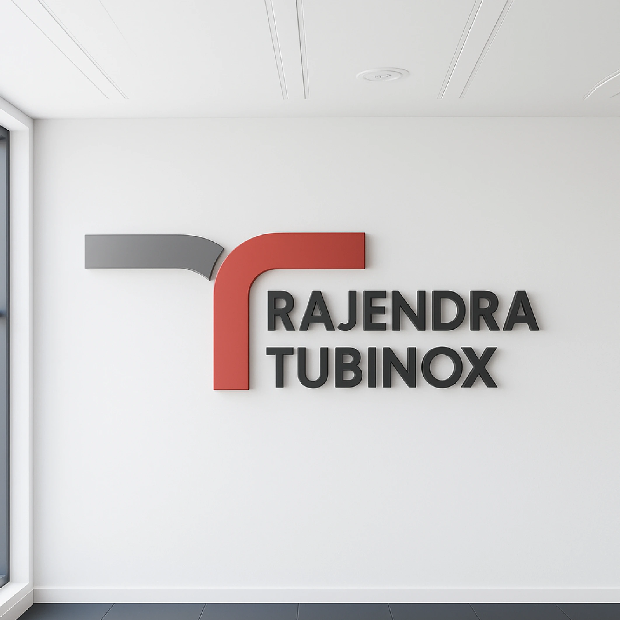
In branding, the key is not creativity alone, but clarity and positioning. For Rajendra Tubinox, a leader in stainless steel tube manufacturing, the challenge was to avoid blending into the sea of generic industrial logos. The answer was focus. By uniting the initials R and T into a strong, contemporary mark, the identity communicates two things at once: engineering precision and modern progress. This is not just another industrial symbol; it positions Rajendra Tubinox as a brand that values strength, trust, and innovation. In the customer’s mind, it now stands for more than steel it stands for leadership.
Client
FIA
Location
Mumbai
Year
2015
Challenges & Objectives
/ Project Overview
We collaborated with Envato to create a visually striking and engaging brand identity that aligns with their core values. Our team focused on delivering a seamless and user-friendly experience while maintaining a bold and modern aesthetic.
/ Challenges
Creating a brand identity that appeals to both young and mature audiences.
Ensuring the website performs well across all devices.
/ Objectives
Develop a visually unique and recognizable brand presence.
Create an engaging and intuitive user experience.
Enhance the brand’s storytelling through compelling visuals and motion design.

Creative
process
We started by conducting in-depth research on the industry, competitors, and target audience. Our team then developed multiple design concepts, refining them based on feedback and usability testing.
Concept Development – Brainstorming initial ideas and design directions.
Design Execution – Creating high-fidelity visuals and prototypes.
Implementation – Bringing designs to life through web development, motion graphics, and interactive elements.
Final Testing & Launch – Ensuring optimal performance and user experience.
