Trinko
n a crowded stationery market, another logo only adds to the noise.
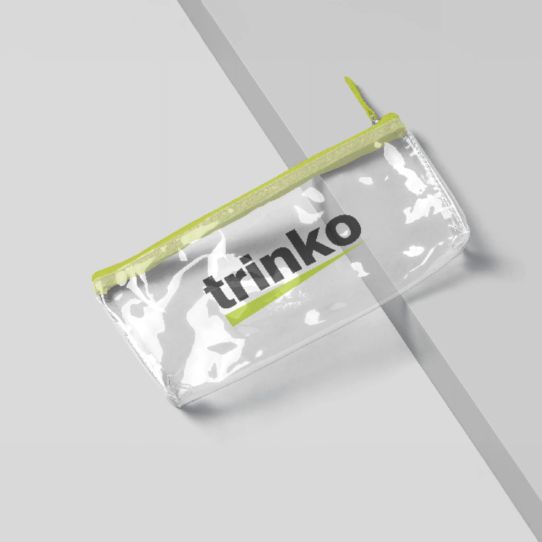
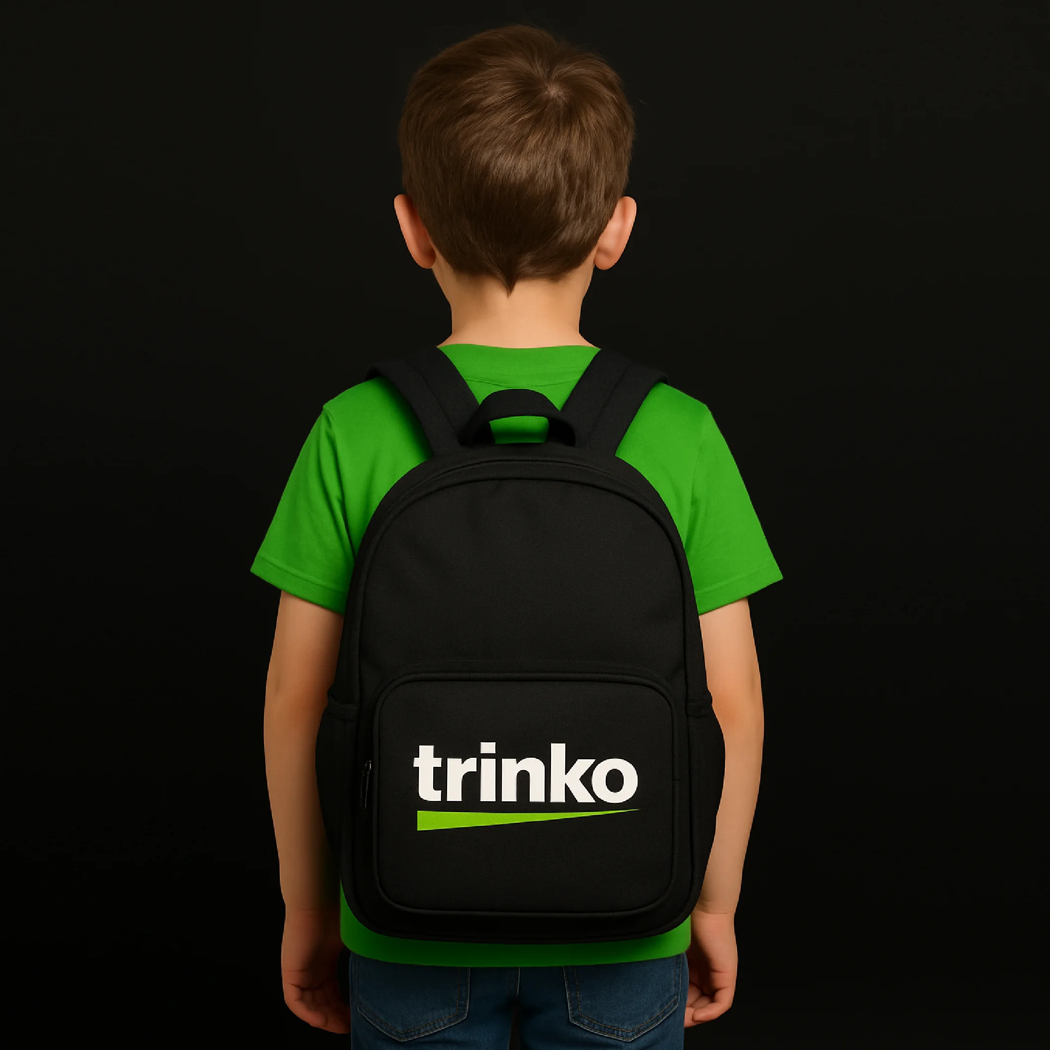
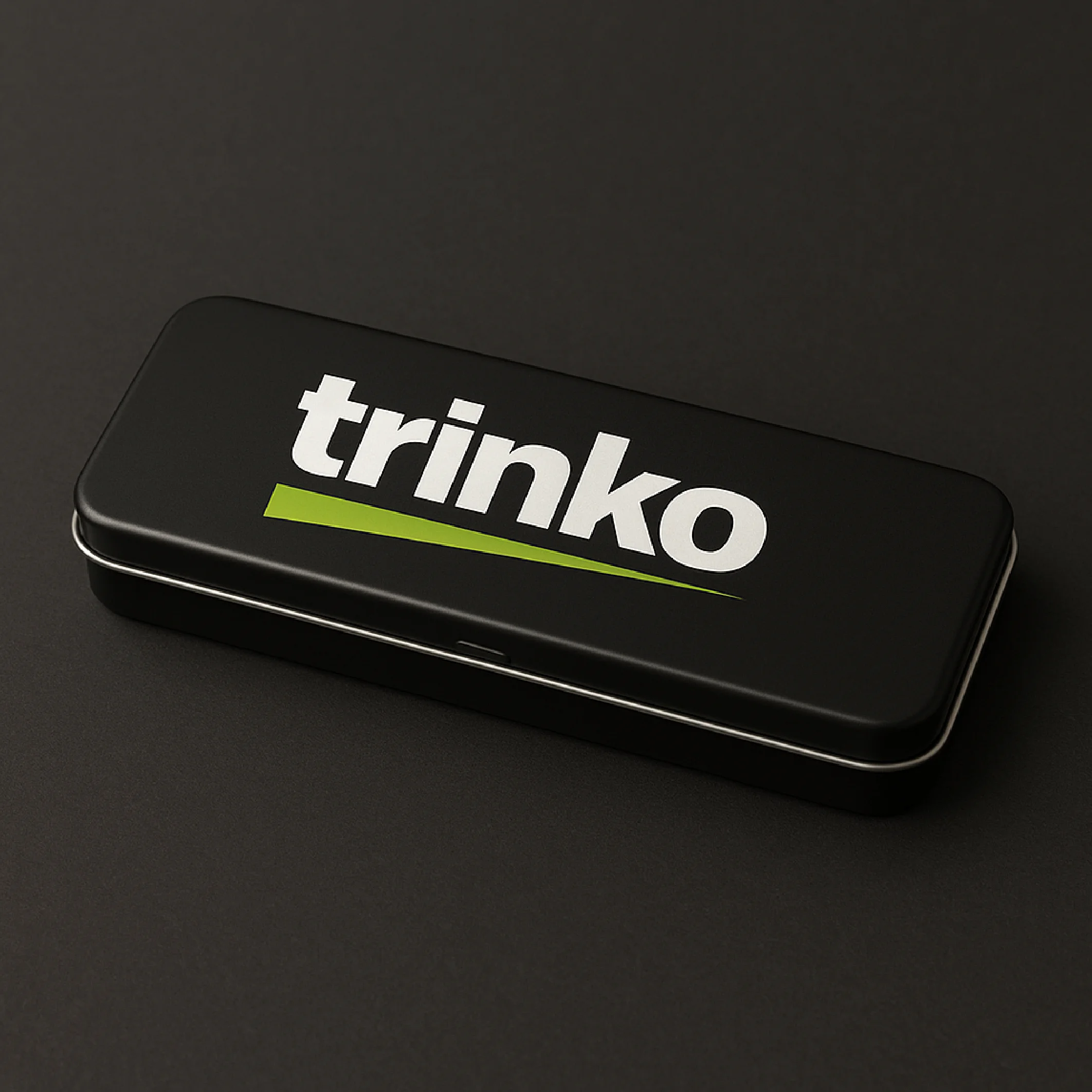
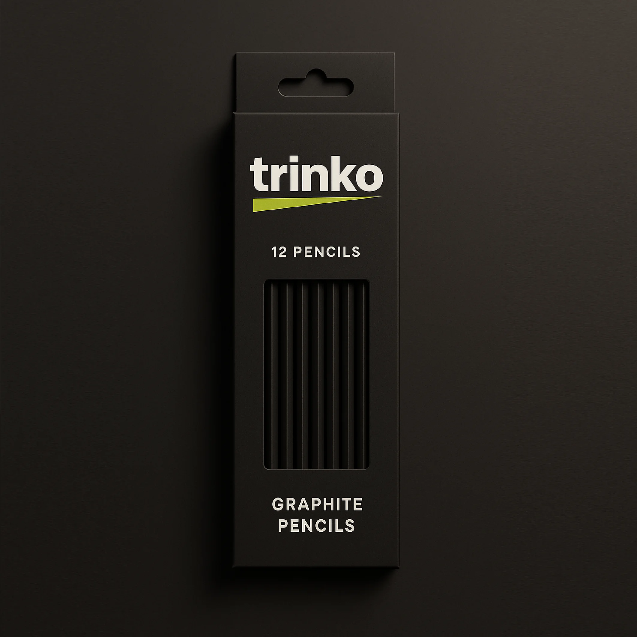
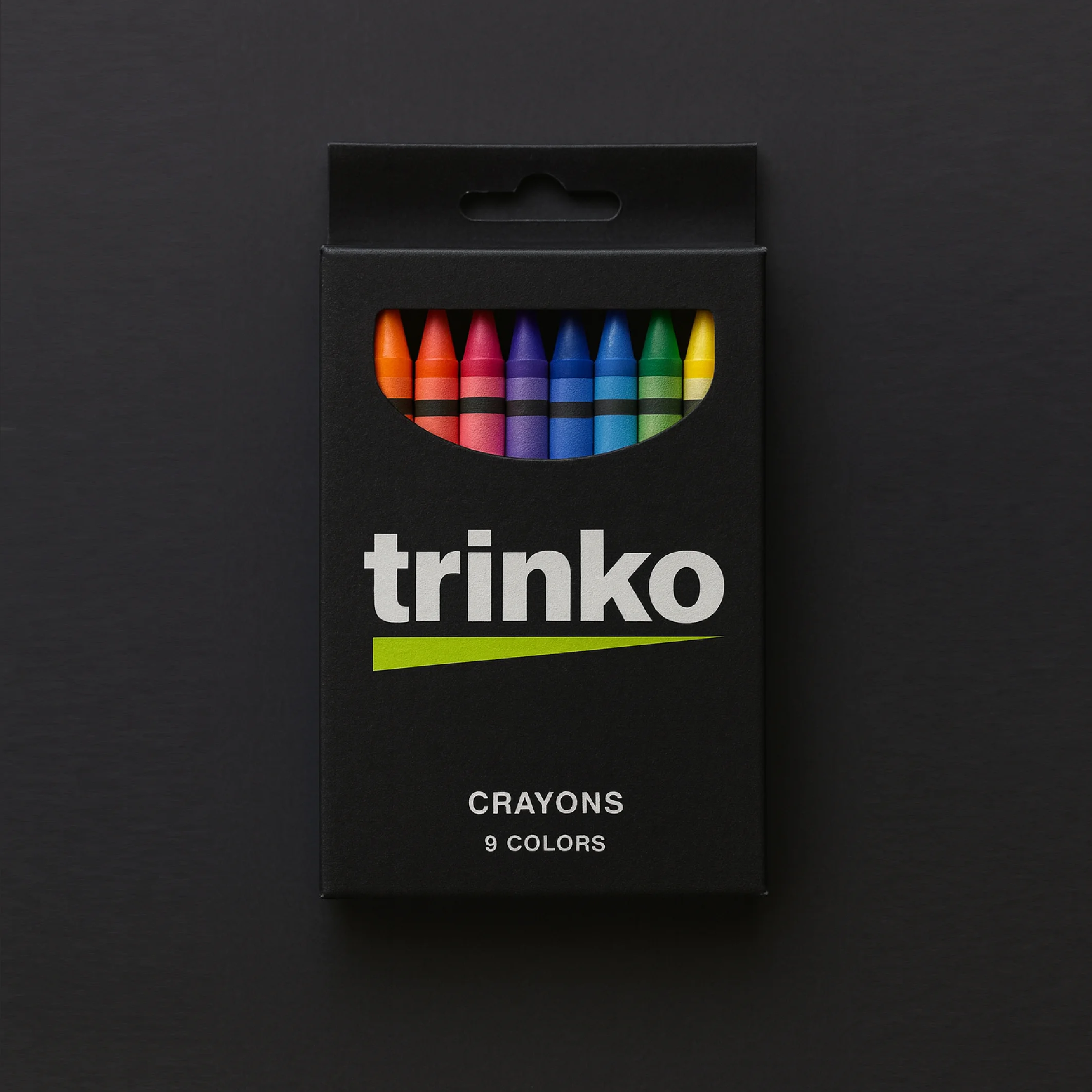
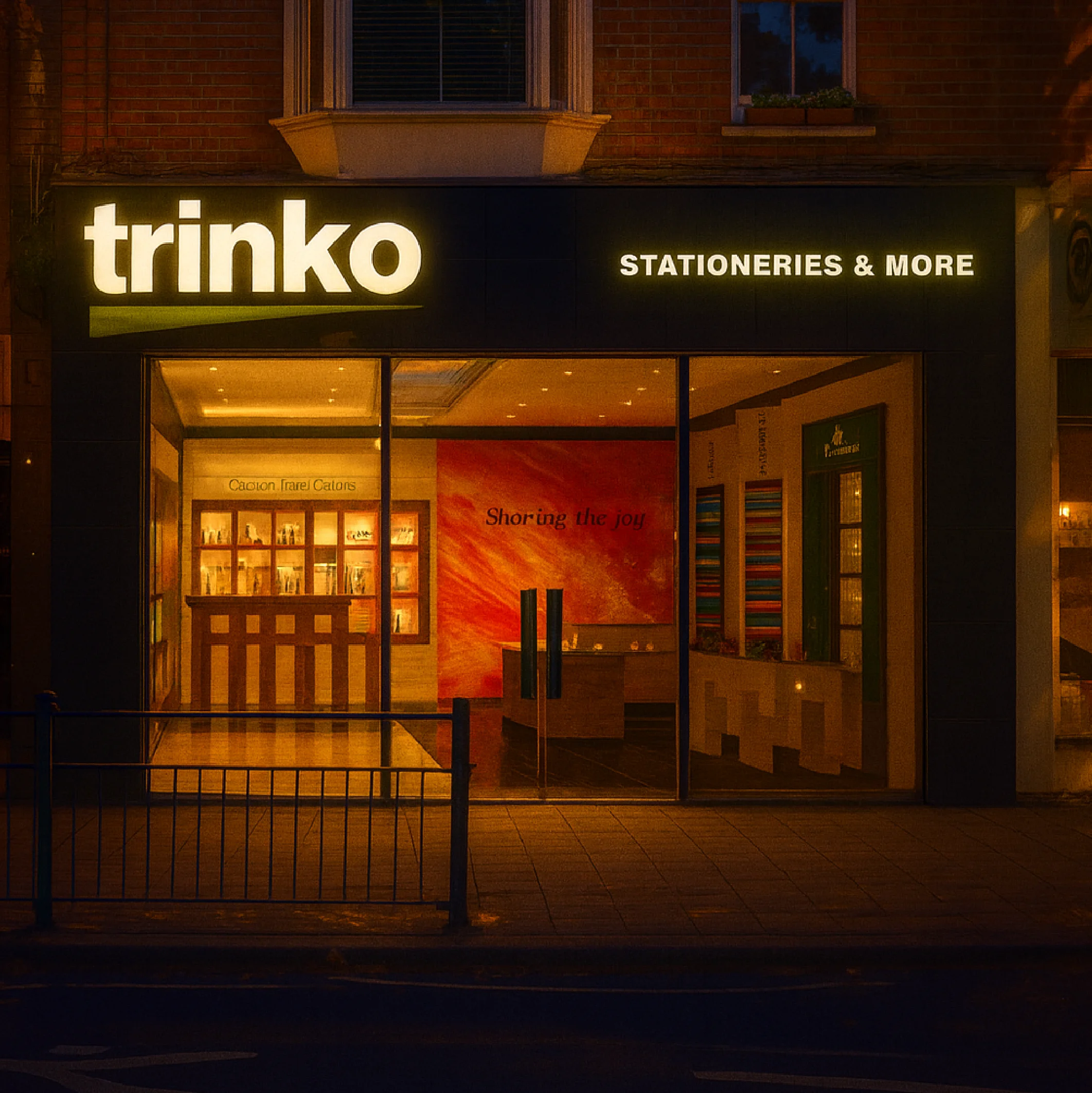
For trinko, a Bangalore-based brand, we chose focus over decoration. The brand doesn’t hide behind symbols. It declares its clarity with bold typography and a sharp dash, a stroke of identity that runs across every product.
Logos may change. Fonts may trend. But a single-minded idea endures. trinko positions itself not just as crayons, pencils, or geometry boxes but as a brand built on simplicity, modernity, and the discipline of design.
In branding, the strongest mark is not what you add. It is what you leave out.
Client
FIA
Location
Mumbai
Year
2015
Challenges & Objectives
/ Project Overview
We collaborated with Envato to create a visually striking and engaging brand identity that aligns with their core values. Our team focused on delivering a seamless and user-friendly experience while maintaining a bold and modern aesthetic.
/ Challenges
Creating a brand identity that appeals to both young and mature audiences.
Ensuring the website performs well across all devices.
/ Objectives
Develop a visually unique and recognizable brand presence.
Create an engaging and intuitive user experience.
Enhance the brand’s storytelling through compelling visuals and motion design.

Creative
process
We started by conducting in-depth research on the industry, competitors, and target audience. Our team then developed multiple design concepts, refining them based on feedback and usability testing.
Concept Development – Brainstorming initial ideas and design directions.
Design Execution – Creating high-fidelity visuals and prototypes.
Implementation – Bringing designs to life through web development, motion graphics, and interactive elements.
Final Testing & Launch – Ensuring optimal performance and user experience.
